How can we help?
Configure contact form
Nachdem der Nutzer den Selector durchlaufen ist, wird ihm die Ergebnisseite angezeigt. Von dort gelangt er zur Kontaktseite / Kontaktformular. Es gibt drei Arten des Kontaktformulars:
- Frei konfigurierbar (Standard Kontaktformular)
- Benutzerdefiniert
- Widget
Sofern Sie noch kein Kontaktformular nutzen, können Sie mit dem Standard Kontaktformular Ihr eigenes erstellen – dies wird direkt in der Kontaktseite eingebunden. Falls Sie bereits ein firmeninternes Kontaktformular erstellt haben, können Sie dieses per URL in der Kontaktseite einbetten. Wenn Sie ein Kontaktformular programmiert haben, können Sie dieses als Widget in die Kontaktseite einbetten.
Standard Kontaktformular (Default Contact Form)
Ein Standard Kontaktformular können Sie unter dem Menüpunkt Form Page > Add Form Page anlegen. Mittels verschiedener Kontaktformular-Felder (Form Fields) können Sie die Kontaktinformationen Ihrer Interessenten abfragen. Dafür haben Sie mehrere Gestaltungsmöglichkeiten. Eine Übersicht über die einzelnen Felder finden Sie weiter unten im Abschnitt Formular-Felder hinzufügen.
Kontaktformular konfigurieren (Form Page Configuration)
Legen Sie als erstes den Titel der Seite und die Bezeichnung des Buttons, mit dem das Kontaktformular abgesendet wird, fest.
Die Benutzeroberfläche sieht wie folgt aus:
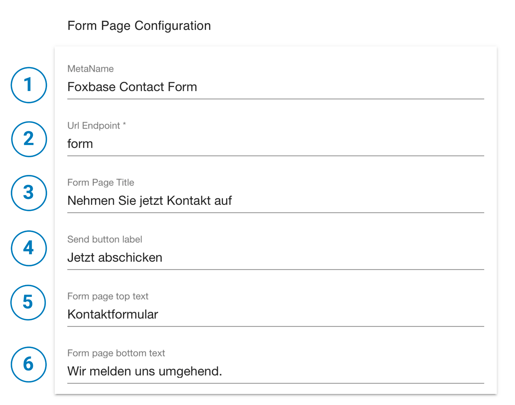
- Meta Name: Name des Kontaktformulars im Backend.
- Url Endpoint *:
- Form page title: Titel der Kontaktformular-Seite
- Send button label: Das Label für den “Senden”-Button
- Form page top text: Text oberhalb des Kontaktformulars (optional)
- Form page bottom text: Text unterhalb des Kontaktformulars (optional)
Um dem Kontaktformular im zweiten Schritt neue Felder hinzuzufügen, klicken Sie auf den Button Add Form Field und wählen Sie das gewünschte Feld. Analog des Fragebogens können hier unterschiedliche Eingabefeld-Typen genutzt werden.
Folgenden Eingabeoptionen stehen zur Auswahl:
- Text Field: Wählen Sie diese Option für eine einzeilige Texteingabe, beispielsweise für den Namen, die E-Mail-Adresse oder die Telefonnummer.
- Text Area: Wählen Sie diese Option für eine längere, freie Texteingabe, beispielsweise für ein Kommentarfeld.
- Checkbox: Eine Checkbox kann beschriftet, mit einem zu übermittelnden Wert hinterlegt und als verpflichtend oder optional gesetzt werden.
- Hidden: In einem versteckten Feld können Sie über Input Name und Input Value Informationen beim Absenden des Kontaktformulars übermitteln, die dem Kunden beim Ausfüllen nicht angezeigt werden sollen.
- Drop down: Der Kunde kann aus mehreren Eingabemöglichkeiten wählen. Die Dropdown-Liste können Sie über Configure Value List erstellen. Im folgenden Beispiel ist die Erstellung der Value List erklärt.
Beispiel: Configure Dropdown

- Language: Nutzen Sie den Selector in mehreren Sprachen, können Sie die Sprache wählen, um verschiedene Feldtitel und Werte einzutragen.
- Label & Value: Über die Konfiguration der Eingabewerte-Liste können Sie die verschiedenen Eingabemöglichkeiten (Label) eintragen und jeweils einen Wert (Value) hinterlegen, welcher mit der Eingabe übermittelt werden soll.
- Add list item: Fügen Sie neue Dropdown-Einträge hinzu.
- Datei auswählen: Diese Zuordnung können Sie auch durch das Hochladen einer zweispaltigen CSV-Datei vornehmen.
- Cancel & Save: Speichern oder verwerfen Sie abschließend Ihre Änderungen.
Formular-Felder hinzufügen (Form Fields)
Die Formular-Felder sind frei konfigurierbar.
Die Benutzeroberfläche der Formular-Felder sieht wie folgt aus:
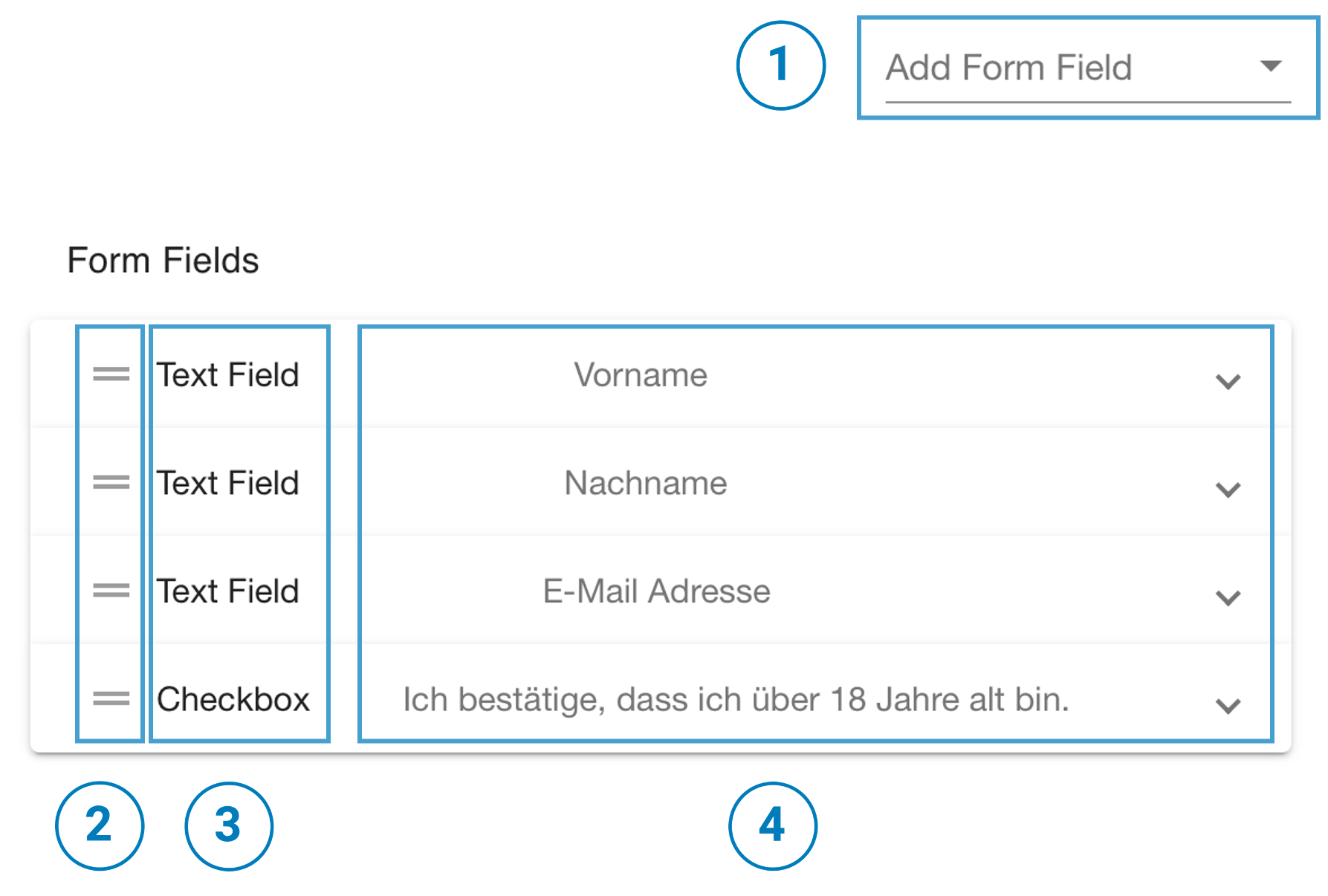
- Add Form Field: Weiteres Kontaktformular-Feld hinzufügen.
- Drag-and-Drop: Die Reihenfolge der Felder in Kontaktformular per Drag-and-Drop ändern.
- Type of Form Field: Es gibt verschiedene Felder-Typen im Kontaktformular. Der genutzte Form Field-Typ wird angezeigt.
- Arrow Dropdown: Zum Bearbeiten des Feldes den Eintrag per Klick öffnen und schließen.
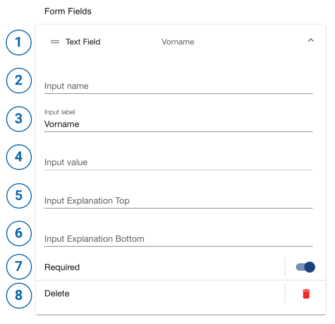
- Form Field name: Der Formular-Feld-Typ und die Vorschau der Feld-Beschriftung wird hier angezeigt.
- Input name: Hinterlegter technischer Name für dieses Feld, welcher beim Absenden des Formulars übermittelt wird. Diese Eingabe kann beispielsweise bei der Konfiguration der Leadaussteuerung per E-Mail wichtig sein.
- Input label: Beschriftung des Eingabefelds im Kontaktformular.
- Input value: Ein hier eingetragener Wert wird beim Absenden des Formulars zusammen mit dem Input name übermittelt und kann ebenfalls für die Leadaussteuerung relevant sein.
- Input Explanation Top: Erklärungstext oberhalb des Eingabefeldes (optional).
- Input Explanation Bottom: Erklärungstext unterhalb des Eingabefeldes (optional).
- Required: Felder können verpflichtend (required) oder optional für den Kunden sein. Verpflichtende Felder werden automatisch im Selector mit einem Stern gekennzeichnet.
- Delete: Geöffnetes Formular-Feld entfernen.
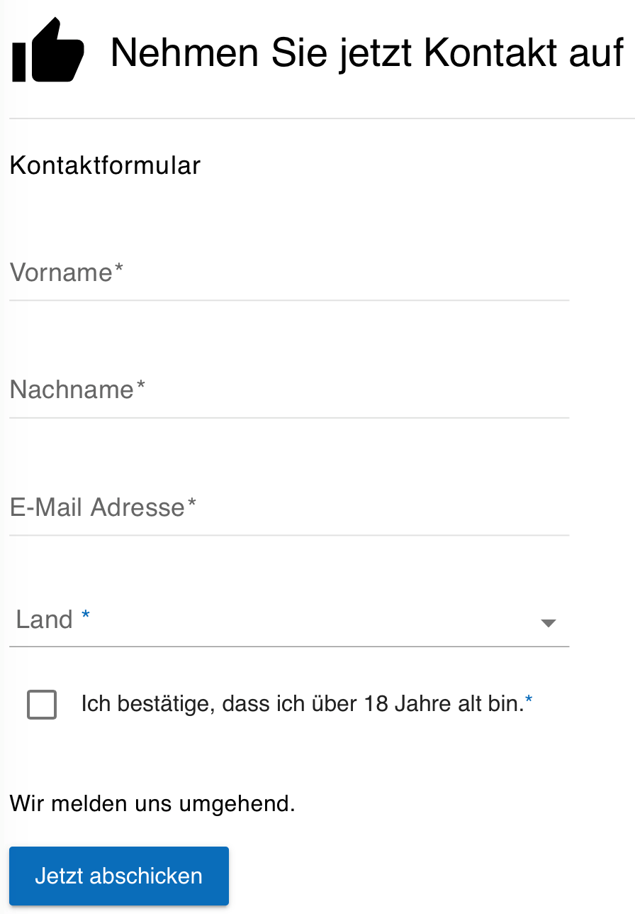
Beispiel: Standard Kontaktformular
Im Frontend wird der Nutzer bspw. mit den aufgeführten Eingaben ein solches Kontaktformular sehen: